I’ve been working on the antagonist’s ship for the Ghost Ship Osiris module and now have the basic ship design down. This is a larger vessel, used by Thrawl and his scavenger crew to collect materials around the frontier and transport them for sale. It’s relatively well armed and with the larger crew, can even take on smaller vessels if it wants to. I still haven’t come up with an actual name for Thrawl’s specific instance of this ship but am simply calling the general ship type the Scavenger Transport. In this post I’ll talk about how I designed the ship.
Initial ship specifications
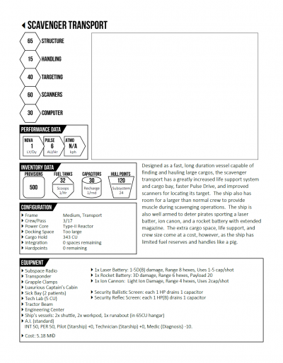
It starts by deciding exactly the roll the ship is to play. I knew I wanted it to have a large cargo area, a bigger than normal crew (to provide muscle in scavenging operations), be relatively well armed, and relatively fast for a vessel of its size. The last bit is because in the module, it needs to be on par speed-wise with the PCs’ ship. And a fast, armed ship isn’t too bad for a crew that works a bit on the shady side of the law. Also the ship has to be able to carry a smaller personal runabout for the captain, again needed for plot reasons.
Given that basic plan, I sat down with the FrontierSpace rules and started picking out systems and features of the ship. Now to be honest, I had a bit of behind the scenes help as Bill has created a spreadsheet to use for basic ship design that helps a lot. That tool is not generally available but I believe Bill is working on a more detailed starship generation system that the basics provided in the core rules. In any case, I was able to determine all of the ships systems, components, and statistics using the spreadsheet. Using that information, I created a basic ship characteristic sheet.
There’s no picture of the ship yet as I haven’t completely designed it and don’t know what it looks like. But now that we have the specifications for the ship, we can start working on the deck plans.
Initial sketches
As I do with most of my ship designs, I start with paper and pencil. I have a nice little Moleskin graph paper notebook that I use to sketch out ideas and designs in so I started by drawing a side and top view of roughly what I wanted the ship to look like. It can be seen here in the upper left of this scan of two of the pages from the notebook (Note: on this an all other images in this post, you can click on them to get them at their full resolution).
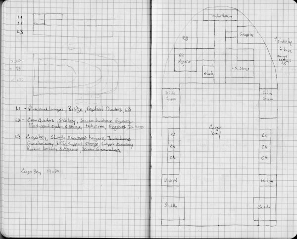
The initial plan was to have three decks, each smaller than the one below forming a somewhat pyramidal or wedge shape. The larger box in the back that spans the upper two levels was to be the hangar for the runabout. The lower level would be taller than the other levels as it contains the cargo bay.
Once I had the basic outline, I started mapping out what I wanted each level to contain. I basically went through all the specifications and figured out which deck the machinery, storage, and hardware would be for each of those systems. You can see that list in the middle of the first page.
The basic breakdown was this:
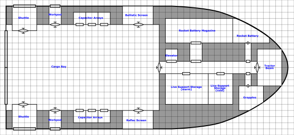
- Level 1 (bottom) – Cargo bay, shuttles and workpods, and many of the ship’s weapons and defenses along with other bulky systems such as life support and power storage.
- Level 2 (middle) – Crew quarters and living space, sensors, ion cannon, engineering and tech spaces
- Level 3 (top) – bridge, runabout, captains quarters, and laser battery
Now that I had the basic plan, it was time to start getting into details. I started with the lower, largest level which can be seen on the second page of the scan above. On limitation of working in my notebook (which is 8.25×5 inches, 5 squares to the inch) is that there is only so much space to draw in. I probably should have sketched at 2m/square but did the sketch at 1m/square.
I stared by working out the cargo bay size. Assuming that one CU from the game rules is about a cubic meter, I figured out how big the cargo bay needed to be (see the notation on the left page) give that the bay itself was 6m in height. From there I started adding in the other features that were supposed to be on the ship.
After I finished this deck I compared it to the top view sketch that I created. I realized that the width matched pretty well assuming that the sketch was done at 3m/square except that the detailed sketch was 6m too short. So I made a note about that (on the upper right) to remind me to stretch it out a bit when I finally got down to drawing it. With the lower level done and an approximate scale, I started in on the next two levels.
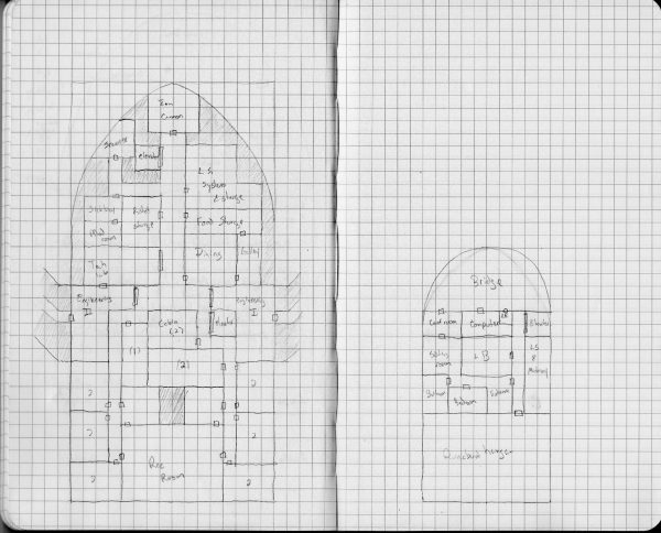
I actually skipped deck 2 to start and did the upper deck first. The reason for this is that I needed to know where the deck access would be so I could connect everything up. I knew I wanted the bridge at the front of the deck spanning the entire width and the runabout hanger at the back. The Laser Battery is actually mounted at the top of the ship so I put it in the center of the deck. I wanted a conference/meeting room off the bridge that was also connected to the captain’s suite. Picking the left side for the conference room determined where the Captain’s Suite would be. That put the elevator on the right and I added in the main computer, some life support space and small toilet off the bridge. This deck was done.
On deck two, I knew I wanted to put the crew cabins and living area in the back of the ship and the working areas center and forward. I actually started this level by putting in the two elevators (one to the deck below and one to the deck above) so I knew how the rest of the design had to work around them.
Next I added in the engineering spaces around where I wanted the engine access tunnels to be. Then came the location of the Ion Cannon (which extends out the front of this deck, not shown) at the front of the deck and then just started filling in details.
Also you might notice that I don’t have the roundabout hanger extending down into deck 2. It would have filled the space where the rec room is and a bit more. That was because as I was doing the sketches, I didn’t look back at my side view (the deck sketches were done several weeks after I made that side view sketch) and I completely forgot that that was my intention. So I decided to just extend it up more instead of down, making the ship even more pyramidal in shape.
Now, if you’re paying attention, you may have noticed that I forgot a fairly important feature that any good spaceship needs. (I probably forgot several but one is definitely going to be added in). Can you spot it? I’ll call it out when I get to drawing up the level it occurs on.
Slightly more detailed drawings
With the sketches done, it is time to start in on final drawings. I do my drawings in Inkscape and if these were going to be the final plans for this ship, they would end up with much more detail that you’ll see here. However, I knew that for this ship at least, I would be sending of the drawings to Bill to create the final version. The reason is that he has a specific style that he has used for ships in FrontierSpace that I can’t quite recreate yet. He had already done the PCs’ ship for this module in that style so I needed him to do the final drawings to match. More on this later. But that means that all I really need to do is get a good working drawing with the spaces mapped out for him to work from.
I like do do these drawings at 50 pixels per meter and 100 dpi. This is mainly due the fact that I started doing maps in Inkscape to digitally recreate some of the original Star Frontiers maps and those maps were all a two squares per inch. Give the preponderance of virtual table tops and the need for maps for those systems, I should probably shift to 70 pixels per square since that seems to be the default for those systems. However, since Inkscape is a vector drawing program, it’s really easy to scale the final map up (by 40%) to reach the desired scale. So I’ll probably stick with what I’m using since the math is easier.
Anyway, I start by laying down a grid. I know how big the ship is going to be so I create an image that is big enough to hold the ship plus 1 square larger on each side. Inkscape has a great extension to draw grids (Extension->Render->Grids->Cartesian Grid) so just use that to make the base grid:
Next I import the scans of my sketches and place them on a layer behind the grid. I have to rotate and scale the sketches so that they match the grid I just created. The sketch for the cargo deck looks like this:
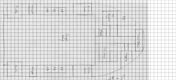 You’ll notice that the sketch doesn’t go all the way to the end of the grid. Remember I said I needed to stretch it out? The final grid is larger than the sketch to accommodate that.
Next we lay in the outer hull. This is done on a separate layer. In the final drawings, the hull will probably have some final thickness and shape to it but for now, It’s just going to enclose the space where the rooms and passages will be. Some may stick out slightly but it provides the overall shape.
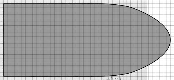 Starting a new layer, I turn off the gray fill on the hull (so I can see the sketch, I could also just play with the opacity if I wanted) and start drawing in the rooms and adding doors. Once that is all done, I turn the gray fill on the hull back on (I’ve also turned off the sketch in the background.)
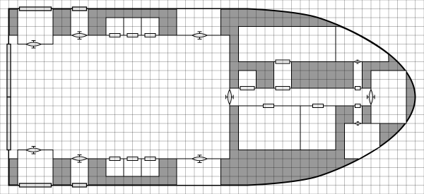 Now, if I were working on the final versions, I’d next go in and add details to all the rooms: consoles, chairs, desks, beds, whatever the room required to show it’s use and function. However, as I’m just sketching out space, this is good enough for now. So we add some labels to indicate what the rooms are:
 Now that deck one is finished, it’s time to do deck 2. This is where I realized I was missing something important. Besides the ship bays and the cargo doors, there’s no way to get in and out of the ship. I seem to have forgotten the airlock. Now originally I was going to just run a passage and airlock through the side of the ship near the dining room/galley in the space labeled food storage, but as I started drawing the plans I realized I had more room over by the sensors than I thought based on the sketch and was able to add it in there. The final deck two looks like this:
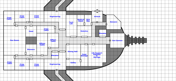 On this deck, the sensor and airlock extend outside the edges of the hull boundary I drew. This ship isn’t designed for atmospheric flight so that’s not a big deal. I also added in the barrel of the ion cannon I didn’t add in the engine areas, just a small passage headed out to them. The engine compartment will probably actually start right on the edge of this map or just off it. They aren’t all that far away from the ships.
From looking at these plans, you may have noticed that there seems to be an awful lot of life support and food storage space. That is intentional. If you look back at the ship stat sheet, you notice that it has expanded life support. The ship is designed to be able to spend a long time out in space without returning to port so it needs lots of space to store food, air, and water as it doesn’t have a complete recycling system, only a partial one.
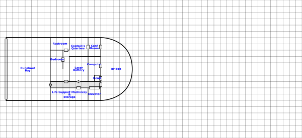
Finally, the top deck. This one’s not that interesting, just a bunch of rooms with a small passage connecting them.
 Finally we need a cross section view that shows how all these things are placed in relation to each other vertically. As I said before, the cargo bay and the runabout hangar are going to be taller than the rest of the rooms on the ship, each with a 6m tall ceiling (most of the rooms off the cargo bay will be this height as well). The other rooms are going to be 3m in height.
The other decision I had to make was how much space to place between the decks. When I’m building ships for Star Frontiers, I typically use 2m between decks. However, for this ship, I decided that the minimum spacing would be 1m (you’ll see why I say minimum in a minute). That gives room for piping, duct work, machinery and such between the levels. That’s also what that big 2x3m area in the middle of the living quarters section is for, to allow for connections between the lower and upper levels.
With that in mind, I drew a rough side view of the ship and placed the decks, elevator shafts and other bits in there relative positions:
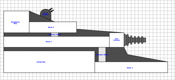 You can see in the front of the ship, there is a lot of space between the lower deck and the deck above. That’s why the 1m was only a minimum. You can also see the laser battery there at the top. The outline of the ship at this point is really rough and I’ll updated it later once I have all the details.
Next Steps
With the basic plans done, I’ve sent them off to Bill to get the final treatment. He was quite excited to see the ship and get to work on the plans so hopefully I’ll have those back relatively soon. I’ll post them when he sends them to me. In case you haven’t seen his deck plan style, here’s the PCs’ ship from the game in Bill’s FrontierSpace style.
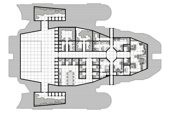 I now have the original drawing for this particular ship so I’ll be working in the future to be able to match it for future drawings.
My plan at this point is to start producing a 3D model of the ship. With the basic plans and design done, I can start working on a model that accurately reflects it’s shape. There will be a bit of back and forth between me and Bill as I work on this so that the outline on the deck plans and the model match. Expect the next big post in this series to be on the creation of that model. I’ve been working on brushing up my Blender skills as I’m going to attempt to create the model with that software instead of OpenSCAD which I’ve used for all my models in the past. I like the programmatic aspect of OpenSCAD but Blender provides much more flexibility. However, I might do a hybrid approach like I did with the Assault Scout model I used in the Assault Scout Technical Manual.
So there you go. A new ship. It can actually be used as is in your games if you want. Everything from here on out is details. Let me know if you have any questions, comments, or suggestions in the comment section below.
