Okay, this project has obviously grabbed my interest as I’ve spent way too much time on it recently. I’m actually writing this before last week’s post goes live and I had to force myself to write the campaign post rather than this one. If you haven’t read the first two parts of this series, they are here: part 1, part 2. So what’s new?
Names
First up is names. I had mentioned that I needed to do some tweaking on the black and white version of the map before I was ready to release it with all the stars labeled with their designations. I sat down and did that one day while my daughter was at soccer practice. That gives us the updated big map.
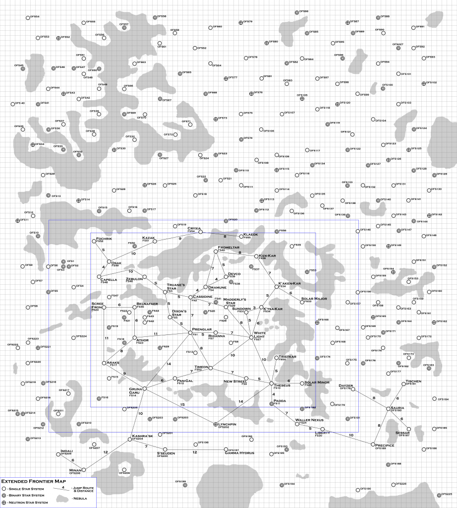
All of the systems (and a few just on the edge) of the original Frontier map (from the Alpha Dawn rules) received an “FS” designation for “Frontier Sector” The few beyond were either afterthoughts that I missed the first time around or ones give that designation in the Beyond the Frontier series of modules. There are 56 of those systems.
All the other systems on the map received an “OFS” designation for “Outer Frontier System”. There ended up being 227 systems with that designation for a total of 283 star systems on the map. The OFS designation dates from when I first made this map way back in the 80’s.
After reading the Beyond the Frontier series of modules, I had the idea for a campaign where the PCs ran an operated a series of exploration missions into the region that Zeb’s Guide declared to be the Rim. I created this map and designated the stars beyond the original Frontier with OFS numbers. The numbers on this map do not correspond to those original numbers (especially since I had to move some systems around to match the Zeb’s Guide map) but that’s where the concept came from.
This is the map of the Expanding Frontier. If I ever place adventures or locations in one of these systems, I’ll use these designations so you can find them.
In addition to adding designations to the larger map, I added the capability into my map generation program to print out the names of the star systems. Currently it randomly generates a name based on the systems coordinates in the random generation portion but reading in data from the file for the Frontier I was able to give the actual names of the systems, either their name or the FS designation. Running the program with that capability results in the following map.
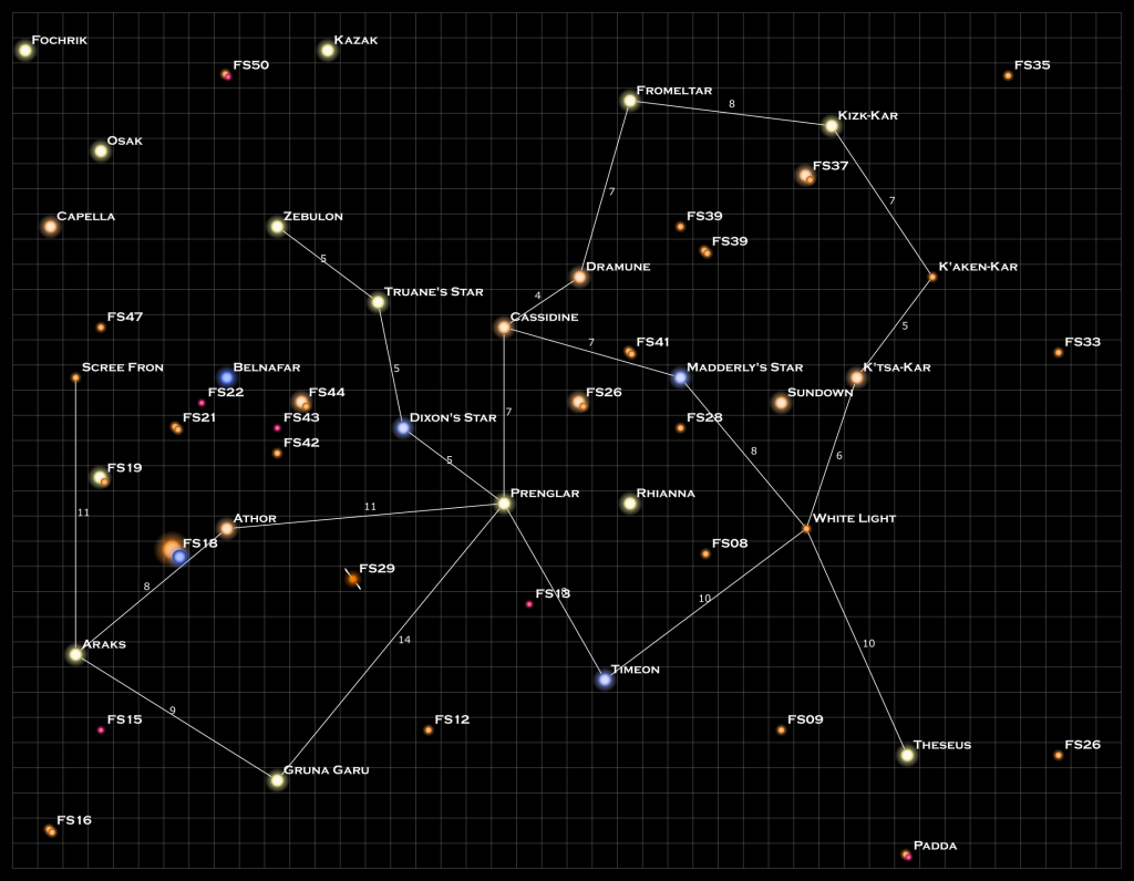
I’m using the Copperplate Gothic Bold font for the text. I just really like the look of that font with its small caps and serifs. It’s the same font I used on the black and white version of the map.
Again, I’ve done nothing to tweak the positions of any of the labeling on this map. That will be a final step that will have to be done by hand. Another behind-the-scenes change I made to the code was to have the output created on different layers. Thus the black background is one layer, the grid is another, the stars a third, the jumps a fourth, and the names on a fifth. That way you can turn each layer on or off as desired when generating the final PNG or JPG file from the SVG file.
Star Scaling
You may also notice that the neutron star jets are larger compared to the one in the previous post. I figured out how to properly scale the symbol for the neutron star to match the others. There were some other internal tweaks to the way I did the scaling in the program that make it more robust and will allow me to do things in a more controlled manner in the future.
Nebulae
With the scaling and the names done, it was time to tackle the nebula.
In the interest of seeing if I could just do the final map if the program drew the stars, names, and jumps (since I have nebula shapes on the black and white map), I decided to sit down and play with Inkscape to see if I could come up with a way to get a nebula effect using the filters built into the program.
I had looked around on-line and there were some examples of how to do a full image, or do make a random nebula and cut it out to paste into your image, but nothing that would take an already determined shape and make something that looked like a nebula out of it. So I was on my own.
This is where I spent way too much time on the project in the past week but I was having too much fun to stop. In the end I did come up with a way to make nebulae that I think I can reproduce within the program itself. It will be specific to rendering the file in Inkscape, but since that’s a free, open-source program, I don’t feel bad about making that a requirement.
Here’s a sample nebula created by this process (which I’ll describe in a minute).
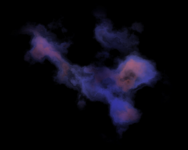
Once I figured out the filter combination to use, I was excited and tried it on the full color map using the nebula shapes from the black and white one. And it failed miserably.
It turns out that the patterns generated depend on the scale of the map and my maps generated by the program were using pixels as the scale while all the test nebula I had been doing were using millimeters, which were off by a factor of almost 4. So I was getting way too much variation across the shapes.
So I had a couple of choices. I could either take the shapes, put them in a document with the correct (mm) scale, generate the nebula patterns, and copy them back into the final document. Or I could figure out a way to make it work in the computer generated document.
I spend a lot of time playing with the filters and making changes to the filter settings trying to come up with something that would work in the programmatically generated maps but in the end I couldn’t find anything that was easy to apply that I really liked. (Or even something that was hard to apply that I liked). In the end I changed my program to output the files, still using pixels, but using millimeters as the scale parameter and things work out just fine.
Using the shapes from the black and white map, and playing with different color schemes to test them out, gave me the following map.
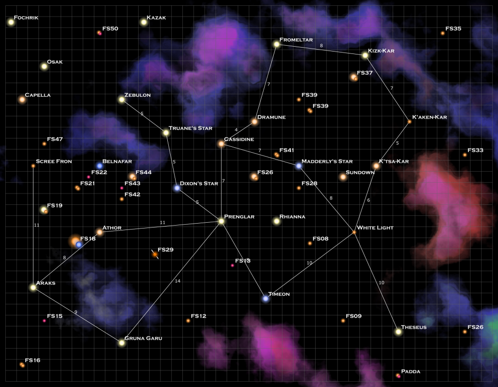
This is first attempt, the final map will have different colors and shapes in the end but I wanted to see what it potentially would look like and play with the color combinations to see what I liked.
The nebulae really bog down the rendering when they are all done so I’ll probably put each of them on their own layer that I can turn on and off as needed to speed things up.
How to make a nebula
So how exactly did I make these? Once I figured it out, it’s actually fairly quick. First, draw a rough shape of the nebula.
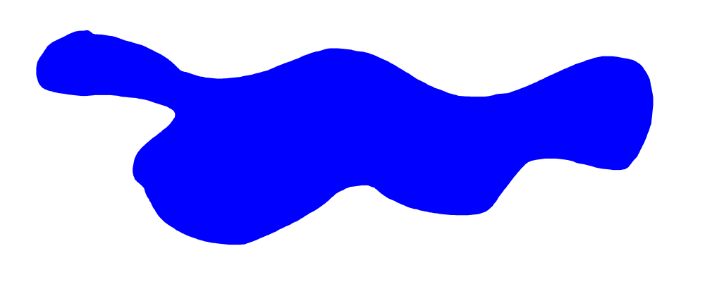
Next, apply two Texture filters. The first is the “Crumpled Plastic filter” (Filters->Textures->Crumpled Plastic). Which gives us something like this:
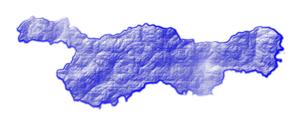
This isn’t the most intuitive filter to apply but bear with me. The various ridges and color variations provide the structure of the nebula when we get to the next step. Next apply the “Watercolor” texture (Filters->Textures->Watercolor). And now we have a nebula.
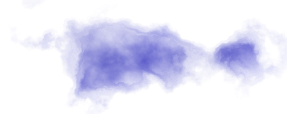
You’ll notice that it shifts the shape somewhat. That’s fine by me because I’m going for the effect more than the exact shape. If the shape is more important, there’s another filter you can use which I’ll talk about below. It also expands the nebula a bit and can make it go outside the original area.
Next we need to add the color tones. This takes several steps. First duplicate the nebula and change the color of the second one. In this case, I’m changing it to purple (#ff00ff).
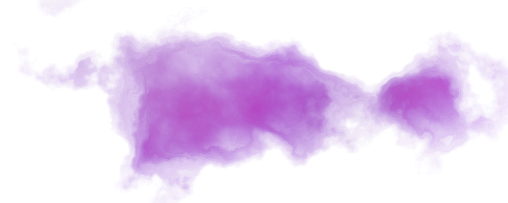
Next shrink the “interior nebula” with the new color. I did this using the Path->Inset command ( ctrl-‘(‘ ), applying it 2-5 times. Then select the “outer nebula”, i.e. the original one, and make it a little larger using the Path->Outset command ( ctrl-‘)’ ), again applying 2-5 times. If that makes everything too big, you can leave the outer nebula size alone and just shrink the inner one. You might also play with the opacity of the “inner” nebula and maybe change the fill from solid to a radial gradient. Just play with it to get something you like.
In this particular case, I expand the outer nebula 4 times, shrunk the inner nebula 5 and gave the inner nebula a radial gradient on it’s fill instead of it being solid.
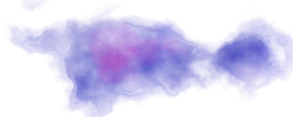
Add in the black background and your done.
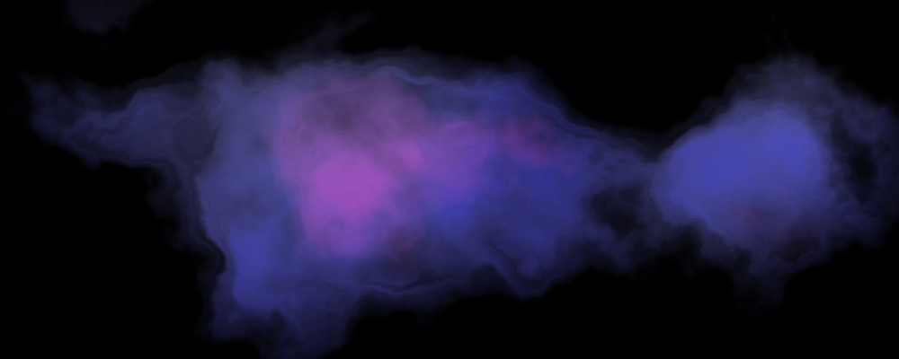
One thing I discovered is that if you move the shape around on the image, it changes the shape of the nebula. If you want to move it around without changing the shape, you have to first copy it and then re-paste it back into the image. That locks it’s parameters and you can no longer change it.
Also, another filter that you can use for a slightly different effect, either in place of the crumpled plastic filter or the watercolor one, is the Inkblot filter (Filter->Textures->Inkblot…). This one has some knobs you can tweak so you’ll have to play with it a bit more. If you want to keep the shape of the final nebula closer to the original shape drawn, you might want to use this filter instead of Watercolor with low horizontal and vertical inlay parameters. I just like the combination above a little bit better.
The great thing about these filters is that you can store them directly into the SVG file. So I should be able to make the nebula directly in the files although they will now only work with Inkscape instead of any generic SVG rendering program. To me that’s a small price to pay.
Up Next
The next step on this journey is to get program to read and write the nebula shapes from a file. Eventually, I’ll also want it to randomly generate nebula on the map in places where there aren’t any stars or jump routes. I have ideas on how best to do that, I just need to play around with the code to make it happen.
How do you like the nebula on the color map? Which color combinations do you like best? Are there others that you think I should try? Let me know in the comments below.