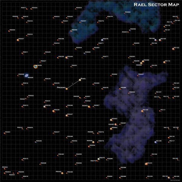
This is another map done using my map generation software. As I mentioned in my last State of the Frontier post, I’ve been itching to make a map of the area of space my book, Discovery, is set in. I’m (very) slowly working on a sequel to that book as well and so want a nice map to go with them.
Unlike the Frontier map, this map has a third dimension with the stars having positions both above and below the plane of the map. This area of space is 40 lightyears wide, 40 ly tall, and 20 ly thick.
The Original Map
I have a hand-drawn map of the sector that I made years ago (2010-2011). I randomly generated the positions in this map via rolling a bunch of dice in small 10x10x20 ly sections (d10 for x, d10 for y d20-10 for height). I had sat down and worked out the approximate stellar density for the region around the Sun and it worked out to 8 stars in that 10x10x20 volume, so I just rolled eight positions in each section of the map. There are 16 such sections. And somewhere along the way I rolled an extra star system since there are 129 systems on the map and not 128. Here’s a copy of that hand-drawn map:
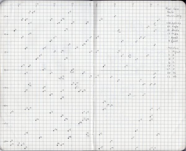
The stellar type tables that I implemented in my program come from this time period as well. I worked them out originally to generate this map. I even rolled up the composition of each of the star systems by hand back then using those tables and have a list of the systems generated. Or at least a composition for 128 systems. They weren’t assigned to specific positions on the map, I had never really gotten around to that part.
And apparently I was still using the original map, not the one copied into my notebook, when I originally plotted out the sequel novel as the notes for that novel are on the very original map as well.
One thing you’ll notice is that the “central” star of the sector, Rael, is not at the middle of the map. I’m not sure exactly why I didn’t just arbitrarily put it there. I do remember that I created the map, and then picked the system closest to the center to be on the central plane vertically. Either that or I got lucky and there was a star near the center.
Since the people in that star system are making the map, it would make more sense if it was at the center but that’s not what I did and I didn’t feel like changing it. The more I think about it though, the more I might go back and do that. I’d just shift all the stars down and to the right by 2 positions and wrap everything that falls off the edge to the other side.
In any case, that’s where the map stood for many years. Until I decided to make the full color version.
The New Map
Let’s start by showing the map. And then we can talk about how it was made.
So to make the color version of the map, I simply ran the program a few times, tweaking the density parameter to generate exactly 129 systems. They weren’t in the right places yet, but now I had all the data I needed, I just needed to update the positions. If I had already assigned the system characteristics back when I rolled them by hand, I might have actually just entered all that data. However, since I didn’t, and I was using the same random tables (with some additional refinements), I went with the new data.
The next step was to update all the positions. This is actually what took the bulk of the time as I had to manually edit each entry to match a position on my hand drawn map. And then somewhere (at about x=26) I messed up and suddenly dropped back to 24 and everything was off and I had to work back through the numbers and find where I messed up.
As I was working through the positions, there were four stars that I knew the general characteristics of: Rael, Proxima, and two systems from the sequel novel. I made sure that systems that matched the expected parameters for those systems ended up in the correct positions. In the case of Rael, there was no G2 star in the data set so I changed one of the other stars (I think an F9) to be the needed spectral type.
The Third Dimension
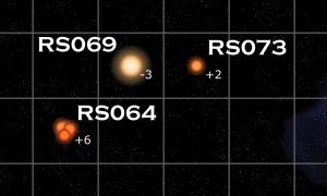
The feature that this map adds that I didn’t have in the Frontier map is that the stars all have a z-component to their position, a distance above or below the plane of the map. Since you can’t easily represent that by position on a flat map, what the program does is write the z-component as a small value to the lower right of the star symbols.
This required a small change to the code to implement. The original version of the code did draw the z-coordinate, and in developing the code for the Frontier map, I had added a parameter to turn the printing on and off. Since I had it off for the Frontier Map development, I hadn’t kept that bit of code completely up to date.
However, it didn’t take much. Mainly, I needed to increase the font size as I realized that it was just a bit too small to easily read unless you were really zoomed in on the map. And that change also entailed moving the positioning of the text just a bit as well. The code now includes a scale parameter that adjusts the text and star symbol size that I added while making the Frontier map. I elected to not have the font size of the z-coordinate scale with the other aspects of the image. It’s fine to stay small if you increase the scale.
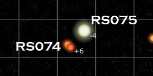
Another aspect of adding in the third dimension is that is is possible to get more than one star system in the same (x,y) position, but separated in the z direction. That actually happened at five different positions in this map. When that happens, the code automatically shifts the stars away from the center of the square where it would normally draw a single system. While it possible to have more than two systems in a single (x,y) grid position, and the program can handle up to four, I’ve never had more than two in any map I’ve examined.
A Word on Names
There are only two named systems on this map, Rael, the home system of the stories, and Proxima, the other star system visited in the first book. In truth, most of the stars probably have names, especially the brighter ones as they can be easily seen from the night skies of Jord, the habitable planet in the Rael system. I just haven’t sat down and figured out what they are yet.
All the other systems, for the purposes of this map, just received RS (Rael Sector) designations. Those were assigned by starting in the upper left and running vertically numbering the systems moving to the right after each column.
Jumps and Nebulae
That was about it for the automated processing. The only other bit was the single jump between Rael and Proxima. It’s a short 5 lightyear jump and the only one that exists at the end of the first book, which is where this map is set.
Next I had to decide if I wanted to add in nebula or not. In this small region of space, with the older stars, there probably wouldn’t actually be any large nebula. But they sure make the maps look a lot nicer. So I decided to add two large ones in. I created these just like the ones I did for the Frontier map although I muted their colors significantly.
You might notice that some of the star systems look like they are in the middle of the large nebula. However, if you look closely, all those systems have a high z position. They are near the top of the map sector. Thus the nebula is actually below them on the map. That is true for both of the large nebula, they are at the bottom of the 3D volume.
There were also some solitary white dwarfs in the sector (and several more that were in binary systems). Since white dwarfs form from the death of stars like our Sun, and those deaths usually involve the creation of planetary nebula, I decided to add in small nebula around those two stars as well. You can see them over on the left side of the map, a little above center. For those nebulae, I simply grabbed a couple of planetary nebula images from NASA ,then scaled and rotated them to fit the map. They are roughly to scale as planetary nebula are typically about one lightyear across and that’s the size of one square on the map. It’s left as an exercise to the reader to figure out which nebulae I used, although it shouldn’t be too hard.
Final Tweaks
The last thing to do was clean up all the names. By default, the program just prints them up and to the right of the star symbols for the system. The ones on the far right fell off the map. The ones in the five locations where there were to systems in the same square were writing on top of the star systems. And some of the nearby systems were overlapping as well. Plus I wanted to move Proxima’s name off of the jump route line. These tweaks were all done by hand.
I also added in the map title in the upper right and the attribution in the lower right. And with that, the map was done. All told, it took about four hours to make the map, most of that being spent entering the positions.
Code Todos
As always, when I work on this, I dream up more things I’d like to code to do automatically.
In this case, it is to be more intelligent about where it places the system names. Especially in the case of multiple systems in the same grid. I’d still probably have to end up tweaking things manually in the end, however, so it may not be worth the effort.
Using the Map in Your Game
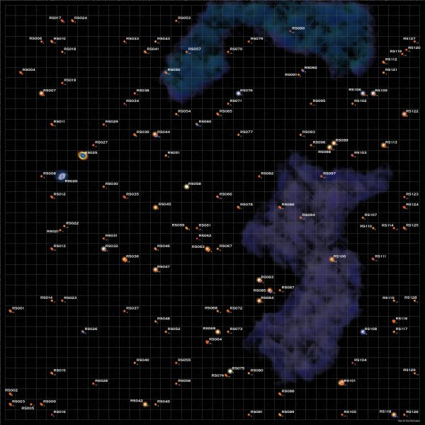
On the the purpose of this blog is to develop and create resources that you can use in your sci-fi game. And if it weren’t for the names on Rael and Proxima, this would just be a generic sector map that you could drop in anywhere. So, to that end, here’s version of the map with the names filed off:
The other thing you’ll probably want is the actual data used to make the map. That will give you the spectral types for each of the systems. That can be found in the file below, which is an input file to the program if you want to use it.
Last Thoughts
And that’s it. Do you find these maps, especially with the stellar data added, useful. Would you like to see more of them in the future.
Also, if you want a printed copy of the Extended Frontier Map, I’m still taking pre-orders through the end of August.
