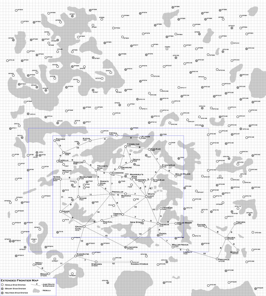
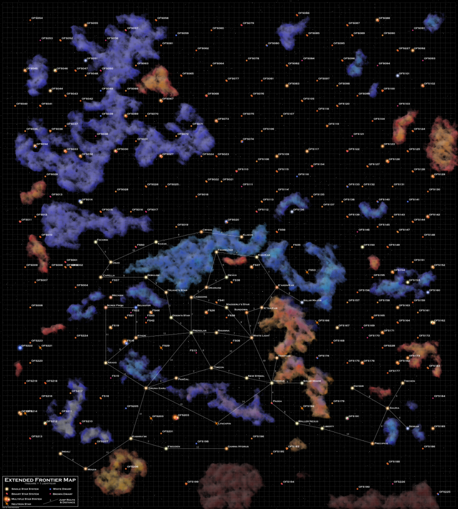
Woo-hoo, we’re approaching the end of this particular project. In this update we present the final* “Player” version of the Expanded Frontier Map, both the color and black and white versions. This version just contains the systems and jump routes known by the UPF as presented in the rules, modules, and some fan content.
(* Final assuming I don’t find any typos and such)
Changes
First up, as I was generating the data for the color version of the map, I realized that there were just way too many neutron stars on the map. There’s one on the original AD map, five on the Zeb’s Guide map, and I had added in a couple dozen or so more.
One is too many for this volume of space. You might find one (anything is possible) but beyond that is really stretching it. However, since the five are in the original materials, I left them in. I also left in two of the ones I added in the lower left of the map. This puts all the neutron stars in the Frontier region and towards the Vast Expanse. Maybe there’s an explanation for that.
For all the other neutron stars, I replaced them with multiple star systems. That changed two dozen stars systems from neutron stars to multiple star systems, some with as many as five stars.
In comments on the previous update, it was pointed out that I forgot to label Mechan, the world in Zeb’s Guide where the Mechanons fled to when they left Volturnus in the Zeb’s Guide timeline. I don’t typically include that event in my games which is why I probably forgot to include it. Mechan is just up and to the right of Scree Fron on the map. That just required changing the label.
In fixing the labeling on Mechan, I also noticed that the Zeb’s Guide map adds another star 3 light years above Mechan near Capella. So I added a star in there as well.
As far as I can tell, that fixes everything.
The Black and White Version
So that gives us the new and updated black and white version of the map.

The Color Version
Creating the color version was mostly a matter a generating a large number of random systems and then positioning them on the map. Since I had to manually update all the positions, that took a couple hours of work to get all the data into the file and the coordinates updated.
After that, I could generate the rough map with my mapping software. The next step was to go through by hand and tweak the position all the labels that needed to be moved. There actually weren’t that many, I just had to move a few names and a few of the jump distances so that they were not overlapping any of the jump route lines. That cleaned up in just a few minutes.
The other major portion of the map was creating all the nebula. Since I had the outlines of them on the black and white map. I just copied (and scaled) those outlines to the color map. In a few places where the B&W map has little wisps of nebula next to the big ones, I connected them as the process I use to create the nebula would make those wisp-like areas.
This actually took less time than I was expecting. Since I was working zoomed out on the map, the rendering went fairly quickly. Whenever I zoomed in, however, it would take some time to redraw the screen due to all the detail in the nebula. From the earlier sample map, which was zoomed in, I had experienced a bunch of slow down and was expecting the same here. I thought I was going to have to do the nebula on a series of layers so that I could turn them off and on. That wasn’t actually necessary and this process only took a couple of hours instead of the several hours I was expecting.
The hardest part for me was picking colors. The truth is that there probably wouldn’t be any nebula in this part of space but since they look cool and were included in the original material, they are part of the map. I tried to pick colors for them based on the stars that were around as most of the nebula would be reflection nebula since none of the stars in the area put out that much ionizing radiation to cause the gas to glow on its own. I’m not completely happy with it but I like it. This is something that might get revisited at some future date.
The next step was adding in a legend. This also might get redone in the future to include each of the different stellar colors but it is good enough for now.
Finally, I decided I didn’t like the flat black background but wanted there to be a bunch of faint “distant” stars speckling the background of the image. To get that effect was pretty simple. I just applied the Textures->Cracked Glass filter to the black background layer. I’ll admit that I got lucky here and it applied the exactl level of background noise that I wanted. There are other filter combinations that would work as well but that was good for now.
With that done, I signed it and exported the final image.

Up Next
The next step is to do the Sathar worlds and jump routes. Since all the stars are there, all I need to do is add in the links and update some labels. That will be the topic of the next and final (at least for a while) update.
Share you questions, comments, and impressions in the comment are below.
One thought on “Expanded Frontier Map – update 5 – The Player Map”