Unsurprisingly, December has been kind of hectic and I didn’t get as much time to work on this miniature as I had hoped earlier in the month but I managed to finish it in time for Christmas.

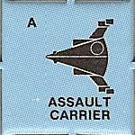
This is a model for which there is no original miniature so this one comes completely out of my imagination. Well, almost completely. Like the others I’ve created from scratch, we at least had the silhouette from the counter. Now this shop deviates significantly from the cylindrical shape of the the other capital ships in the UPF roster and actually looks a bit more like the UPF assault scout. It’s also radically different from the silhouette given in the UPF Campaign book that I’ll use for a different version. In any case, this was the basis I used for the model.
Building the Model
The first thing I needed to do was figure out a scale. According to the rules, the Assault Carrier is supposed to be hull size 16-18. This makes it a bit bigger than the light cruiser but smaller than or on par with the heavy cruiser. We’ll see how well I did with that later but based on the size of those models, I picked a scale and got started.
The first order of business was to get the basic body shape down. I knew that I didn’t what to make it as thick as it was wide since that would make it very, very massive. So while I matched the silhouette, I made the fuselage flattened rather than as thick as it was wide. I didn’t have any good idea what that circle on the silhouette was supposed to be so I just left it off. I suppose it could be a really big dome but it was right where I wanted to put the fighter hangars so I ignored it.
I again reused the standard UPF class C engine that I’ve used on all the other capital ships That makes it differ somewhat what from the silhouette as they are longer than depicted but that’s not really a big deal. The gun batteries at the nose are also a bit bigger than depicted on the counter.
With the basic shape done, it was time to add surface detail. The first thing I did was add in hangar bays for the fighters. Since an assault carrier can hold 8-12 fighters, I decided that this one would have 12 bays. There are three on each “face” of the fuselage. They are the three rectangular structures sticking out toward the back (thicker) part of the ship. Each one represents a bay for a single fighter.
After that it was just a matter of adding details to give it some character like the other ships. I turned out that there was a lot of surface to cover on this model, more than on the others. I reused some of the surface detail structures from the other models and created a few new ones for this model. I’m starting to build up quite a collection of objects.
The angled surfaces of this model provided some interesting opportunities to play with the relative rotation of the details having some parallel to the surface and other (like the hangars) not rotated to be at the same angle. For each face of the model, I composed all the surface features on a flat, vertical plane an then rotated it to be flush with the surface of the ship. This make positioning everything much easier.
When adding in all the detail, I struggled between how much regularity to include (e.g. identical, regularly spaced features) versus applying a bit of randomness. You can be the judge of whether I hit a good balance or not.
All told this model took about 8 hours of works spread out over a month of time, often in 15-20 minute increments here and there when I could find the time.
Printing
This post would have been up a bit sooner but there were some issues in getting the model printed. Well, printing was straightforward, but getting the final model rendered ran into some problems.
There is a lot of detail on the model and in the end, my laptop that I do the modeling on was unable to do the final render to the printable file at the high detail level I wanted. It kept crashing due to running out of memory. In the end I had to render it on my big computer (which I’ll probably do as a matter of course from now on as it has more memory and a faster CPU). And even then there was a weird problem in the rendering that I had to figure out. Since it took 2.75 hours to render, even on the big computer, that was not a fast process.
From this I’ve learned that I need to start being more selective and assign rendering detail at the individual element level instead of globally. The issue is really on the round pieces as you get lots of vertices in those parts that really are needed on the small parts but if you don’t have it on the larger pieces, you notice the individual faces. I’ve been setting the detail level high so the big pieces (the lobes and weapons balls in this model) look good but that’s been serious overkill on all the small parts. In the end, the raw model file for this ship was 381 MB. The next largest ones were the space station at 239MB and the battleship at 215MB. So that’s something I’ll be looking into on future models.
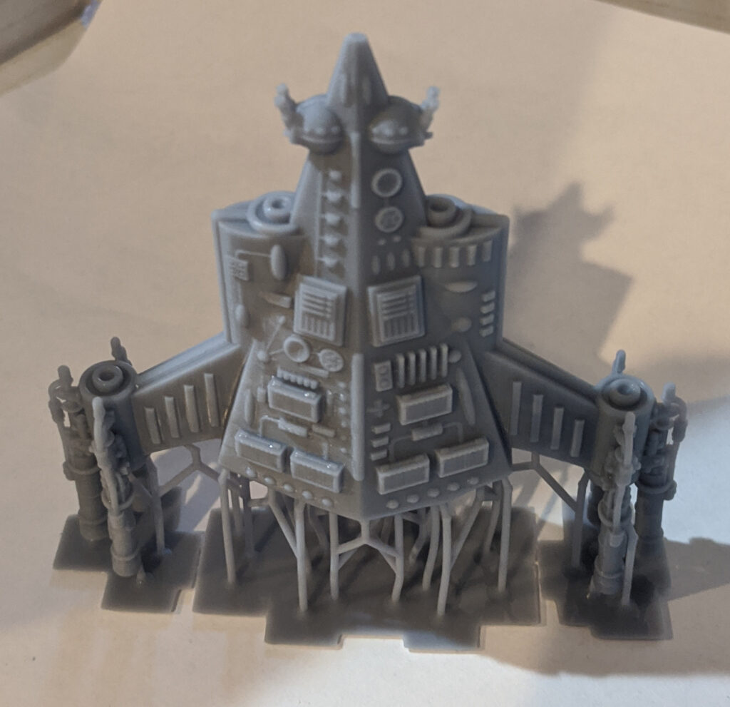
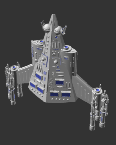
I finished the model Sunday afternoon and thought I’d have a print by Monday morning but all the rendering problems resulted in me not getting the print started until late Monday afternoon. It takes twelve hours to print so it just finished this morning. But it printed and it looks great. Here’s a picture of the side not shown in the model image above. It still has the printing supports on it as it’s not done curing yet. They will all get removed once that is done.

I was very happy to see out it turned out. The details in the model image looked a bit over powering, maybe because of the color scheme the software uses. But printed, they looked just right.
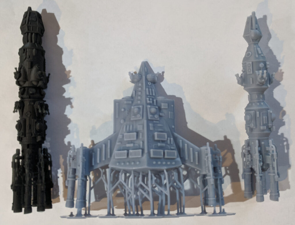
Earlier I mentioned that we’d check in on how I did on picking the scale. Here’s a picture comparing the assault carrier with the battleship (left) and heavy cruiser (right). I probably should have included the light cruiser as well but didn’t. This image shows the side of the assault carrier that was in the model image.

The assault carrier should have roughly the same volume as the heavy cruiser. It’s shorter but much fatter. And going by the volume of resin needed, more than double the size. So on an empirical basis, I probably made it a bit too big but I actually think it looks just about right aesthetically. So I’m happy with it as it is. However, it’s way too wide to use as a chess piece if I do make a chess set with the ships so I’ll have to think about that.
Coming Up
I’ll get the model posted up on DriveThruRPG in the coming week (and updated this post with a link) as well as getting it added to my Miniature Price List page.
This finishes all the UPF models except for a new minelayer. I’m holding off on that one as you can use the sathar cutter miniature in a pinch since that one matches the silhouette of the counter in the game. I’ll revisit that model soon but next up is the Sathar Assault Carrier.
A year and a half ago when I started this blog, the Sathar Assault Carrier was one of my original projects that I’ve managed to not spend any time on. This will not be that version of the assault carrier as I wanted to create a full set of deck plans and a model that matches them like I did for the sathar destroyer. That’s a very large project. This version of the miniature will be created just as I’ve done with the UPF Heavy Cruiser and Assault Carrier – using the counter silhouette to give its shape and adding surface details based on the existing miniatures. The sathar ships are less cluttered so this should go faster.
What do you think of the UPF Assault Carrier? Let me know in the comments below.

“I again reused the standard UPF class C engine that I’ve used on all the other capital ships That makes it differ somewhat what from the silhouette as they are longer than depicted but that’s not really a big deal. The gun batteries at the nose are also a bit bigger than depicted on the counter.”
Given the fact that you are working off of a counter rather than a drawing or miniature, these are good calls and easily forgiven.